Kitchen remodels are one the of the top projected home projects that homeowners will complete in 2017. People spend most of their time here. This is also the area of the home where the most money is spent when renovating. A good kitchen will convince a buyer to buy. A bad one will send them packing!
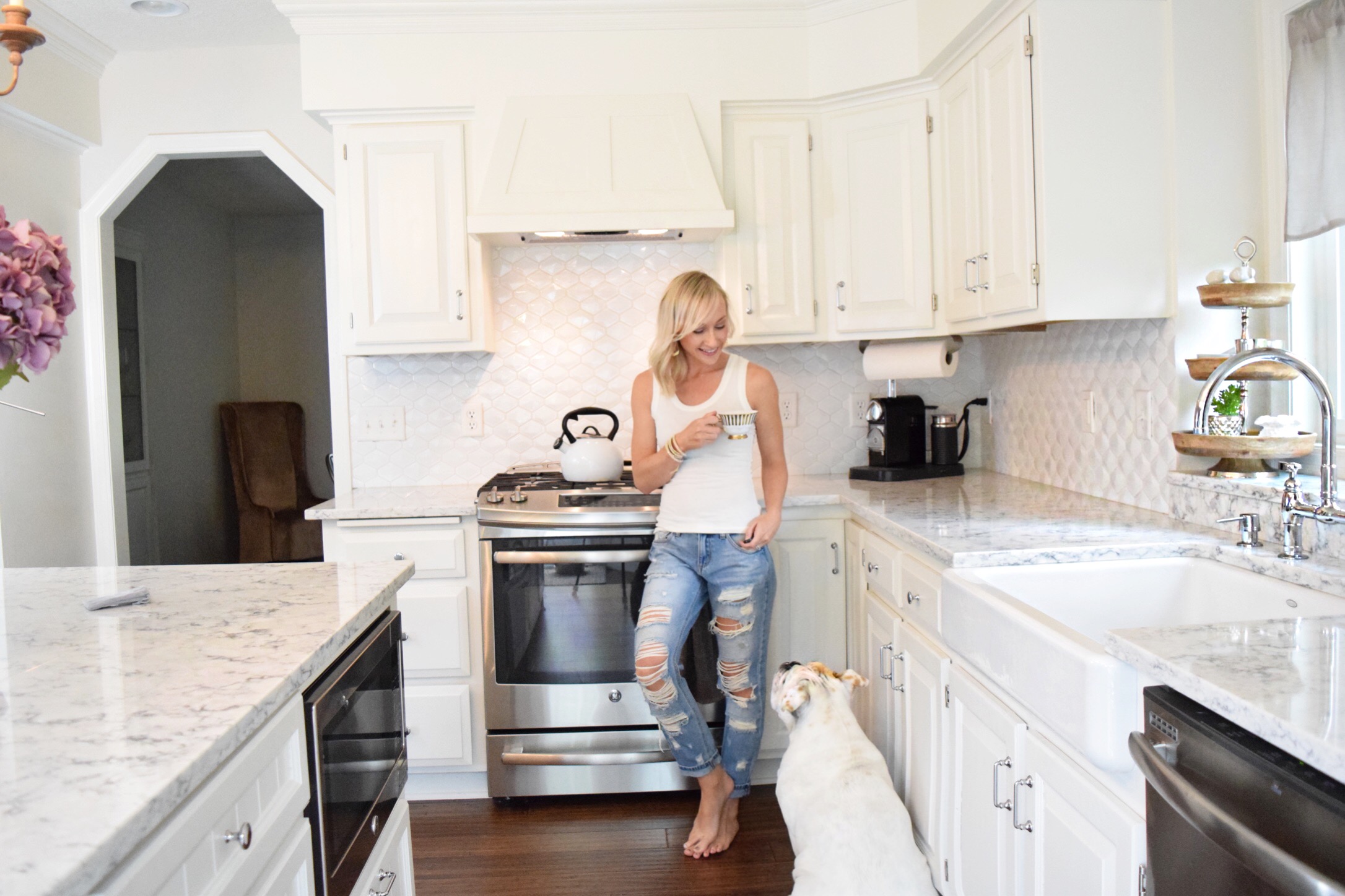
Doing the project right is so important for people planning to sell in the next 5 years. The kitchen should appeal to future buyers as well as the current homeowner so they can enjoy it while they are there. This kitchen was completed in our most recent home renovation sale. It had multiple offers in less than 2 weeks! Buyers like to see homes that they can move right into and start living their life. Buyers see value in completed remodels. That is not to say that you should spend all of your money on top of the line products. Quality updates are good but over the top is bad. The ROI is the key factor in deciding what seller should spend their money on. The kitchen is key!
3 of the biggest problems:
- Poor Layout
- Outdated Colors and Materials
- Zero Wow Factor
More specifically. Old appliances, flooring, wallpaper and cabinet color brought this kitchen down. The kitchen cabinets were in good condition but needed an overhaul. Notice the soffit? It made this ceiling feel so low! Empty, un-utilized space in the center of the kitchen was screaming for an island! By adding an island it would make an area for decorative lighting that would give the room wow factor.

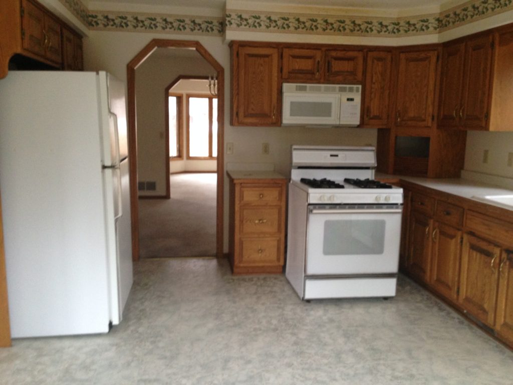
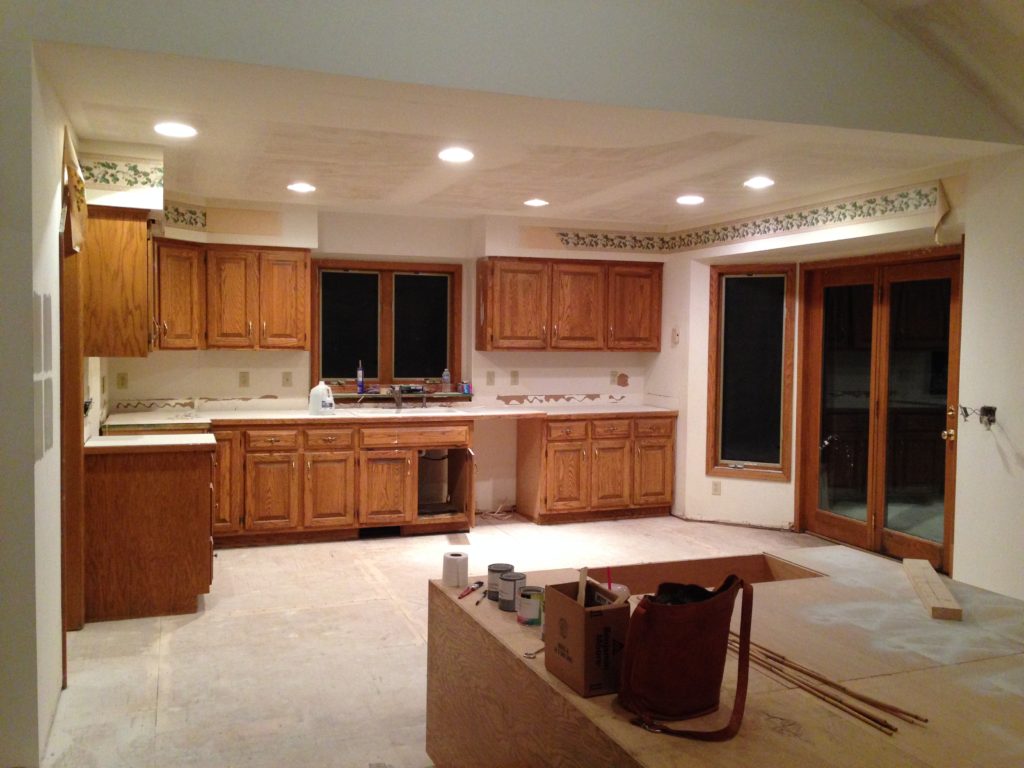
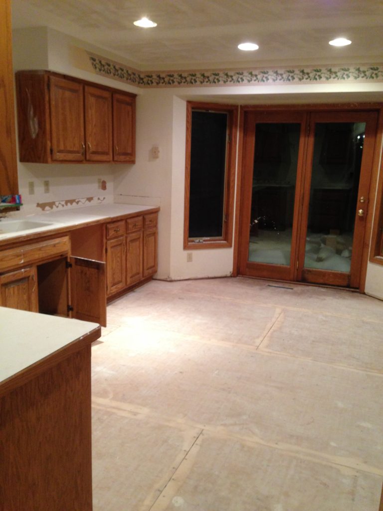
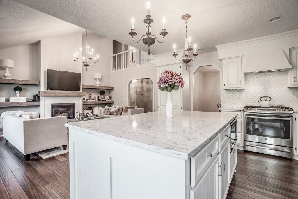
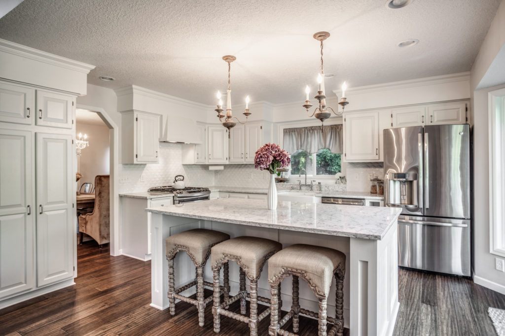
Some easy corrections were made. Others took a bit more effort. All of the cabinets got a professional coat of sprayed on enamel paint. Benjamin Moore Satin Impervo in “cloud cover” was used. The illusion that the cabinets went to the ceiling was created by painting the soffit the same color as the cabinets. A new island was added, making a space for bar stools and meal prep. The microwave was moved to the island to make space for a focal point cooking area with a custom hood vent.
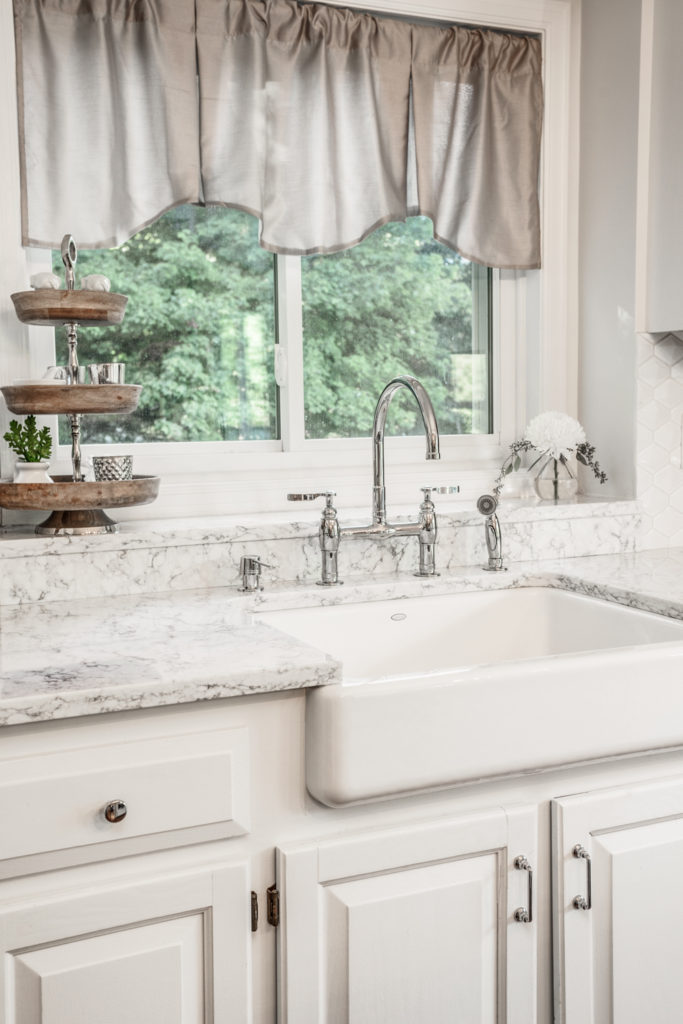
Countertops really set the tone for the kitchen style. I am a big advocate for quartz. It has the look of marble but with the durability of a manufactured stone. The better the product, the more realistic it looks. LG Hausys Viatera in “rococo” was used in this project. Rococo looks just like marble and was used throughout the home!
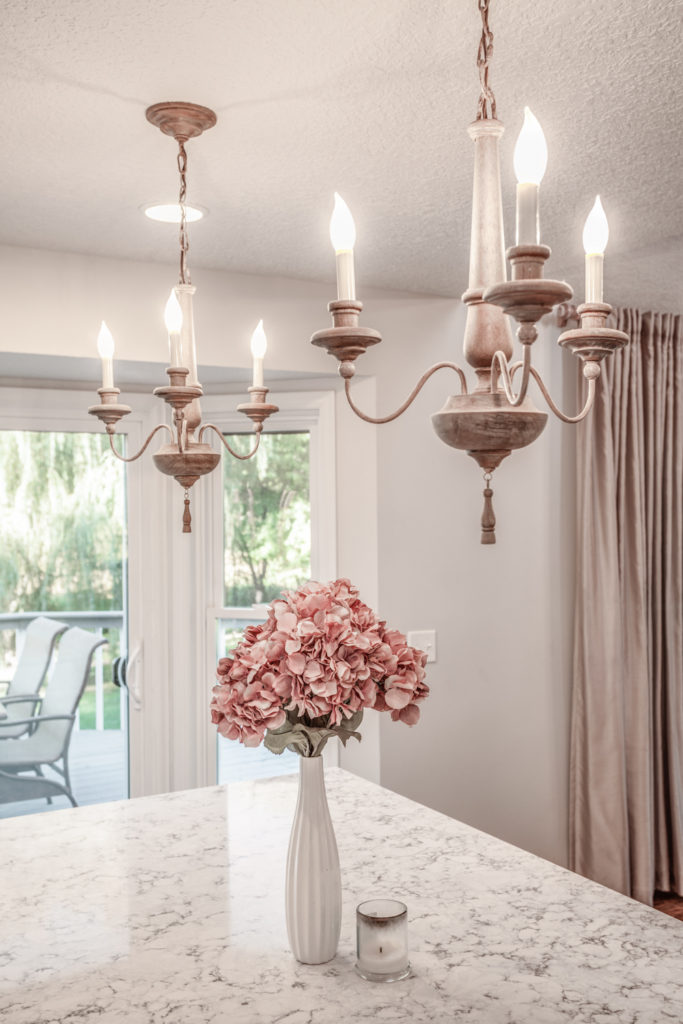
Lastly, the pendant lighting and tile backsplash were the final components to as great kitchen. When creating an all white kitchen, texture is needed to add interest. Raised, white tortoise shell tile created the needed texture for the white on white look. Little pops of distressed woods helped with the flow to bring your eyes from the floors to the lights to the decor. They also brought much need warmth to the all-white space!
Kitchen Remodel: Spaces That Sell
February 3, 2017
Leave a Reply Cancel reply
@ 2022 ADORNED HOMES
INFO@ADORNEDHOMES.COM
DESIGNED BY HONOR
@2022 ADORNED HOMES™ | INFO@ADORNEDHOMES.COM | Showroom By Appointment

0
Be the first to comment