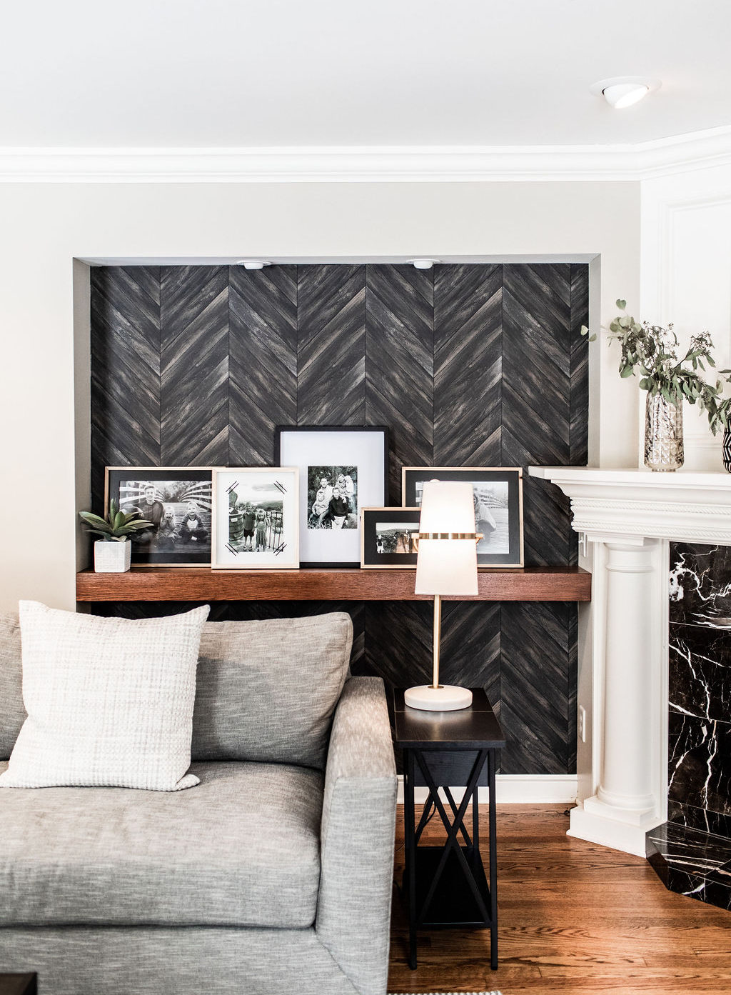
This living room reveal has been on my mind for a while now and I’m so excited to share it with you! We did a heavy facelift on this space complete with some custom pieces and special design “moments” thoughtfully placed throughout the room.
I met this sweet family a few years back while renovating an investment property next door in our hometown neighborhood, North Oaks. Strangely enough, the mom of 3 went to the same highschool as me but our times there never coincided!
They had a list of home projects to be tackled in the future but, for starters, settled on the formal living room at the front of the home. This is a room that they actually use regularly, it’s not just a formal living room that guests see as they enter the house and the kids aren’t allowed in! No plastic covered sofas and fragile chachkie’s here! It needed to be comfortable but also put together because it is one of the first rooms you see when you enter the home.

The rest of the home is a mix of warm wood tones and white base trim so we needed to blend the current home with the future plans for renovations and updating.
The nooks dated the space but offered a huge opportunity to create special focal points or design “moments” if updated correctly. A perfect place to display family photos and personalize the room! You all know how much I love a good wallpaper print so we found something that blended the old with the new so seamlessly it looks like it was custom made for the room. This one was a Brewster Home Fashions washable paper in a dark brown & black combo. Custom built floating shelves finished off the nooks and were stained to compliment the wood floors.


Family photos now adorn the floating shelves giving the room a personal touch. I love to do photo groupings and use one cohesive color, a sepia tone was used for these ones. Choosing a common theme can be a good way to coordinate photo colors if you love the color, think blues from a beachy vaca or dark green from a hiking trip.


A cooler, brighter wall color was done but thats it for paint, all of the white woodwork stayed as is! This is the first Farrow & Ball color I have used and it didn’t disappoint! New furnishings and decor were added to top off the fresh look of the room and voila, a heavy facelift that didn’t require cutting into walls or tearing into the main components of the room!


Needs:
- livable space
- cool down and brighten the colors
- furniture layout that still allows enjoyment of the fireplace
- a place for the piano
- a reclining arm chair that didn’t look like a typical recliner
What was done:
- wall paint
- wallpaper installed in nooks
- custom floating shelves built, stained & installed
- sofa and lazy boy recliner in custom fabric, tables, rug, media console, drapes & curtain rods, lamps, decor & florals
Contact katie@adornedhomes.com for design and real estate inquiries. PhotoCred Chelsie Lopez Productions
Makeover: Blending A Formal Living Room With Real Life Use
February 20, 2020
Leave a Reply Cancel reply
@ 2022 ADORNED HOMES
INFO@ADORNEDHOMES.COM
DESIGNED BY HONOR
@2022 ADORNED HOMES™ | INFO@ADORNEDHOMES.COM | Showroom By Appointment

0
Be the first to comment