The recently completed North Oaks project was a major feat! And the kitchen portion was a journey of it’s own! I have been waiting, for what seems like forever, to share the before and afters of this project so hold on tight, this one is a real transformation!
When we started on this project in February of 2017, we had no idea how much the real estate and construction industry was going to sky rocket! Because of that, the North Oaks project took a back seat to our full time roles with our clients (I have some amazing client transformations from the summer to share also!). 7 months later the project is complete and the home is on the market! And phew, we are ready to look back on what was done!! 
The first piece to the project I want to share with you all is the kitchen, the central hub of the home. With its necessary gigantic “catch all” center island, repurposed wood beams and soft gold lighting this kitchen takes the cake on mid-century modern meets todays style. A 1977 built North Oaks home that was renovated in the early 1990s, the kitchen had a lot of character but lacked modern amenities. We wanted to honor the mid-century modern style of the home while still keeping in mind what would appeal to buyers, always something of importance when renovating for re-sale. It was an interesting concept to achieve and it happened through alot of design planning. The previous kitchen had a couple of key factors that were inhibiting its potential. 1) the closet in the entryway jutted into the kitchen blocking the window and enclosing the space. 2) there was a wall separating the dining room from the kitchen which also blocked the natural light from the 2 large patio doors in the dining room. 3) there was a weird little pass through over the sink looking into what would be the future master suite (this pass through went into a room that functioned as a sort of party room complete with a fireplace, hot tub and patio doors walking out onto a private terrace!). 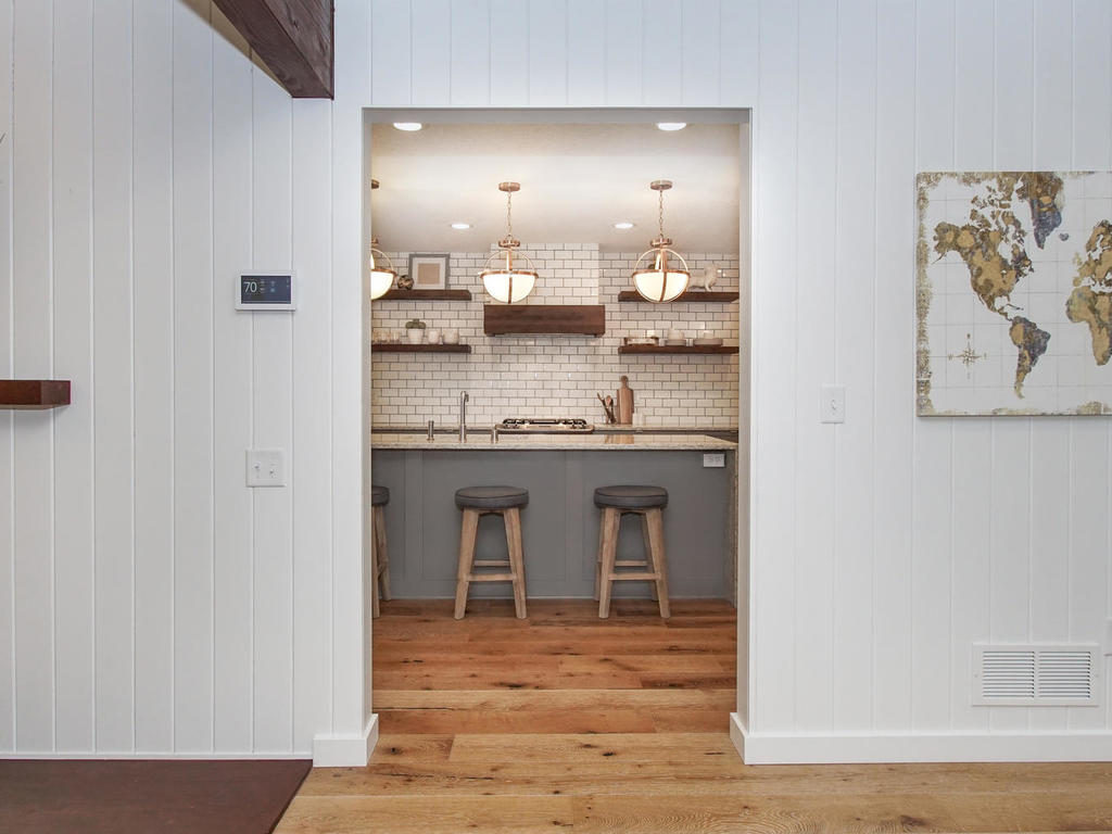
SO, how to make this space better? We mulled over tons of layouts. Drawing them on the floor, laying it out with 2×4’s. We usually go over a handful of options before settling on the best one when we are doing our renovations.
We settled on a plan that entailed closing off some areas and creating hallways where there was once open space. Sometimes you have to close off spaces to make them better. Open concept…Take down all the walls…Make the entire living area one open space! This is what a lot of people want to do these days. Well, it doesn’t always make it better. This home was a prime example. It lacked a killer master suite but had a large party space behind the kitchen. The current party room entrance was right in the middle of the kitchen, not a good place for a master suite so we opted to take away some of the depth to the kitchen to create a private hallway that lead to the door to the master suite. This created an extra wall for the fridge and additional cabinets plus space to hide the often messy mudroom! 
The 2 biggest changes to the layout; the wall removal between the dining and the kitchen and the removal of the entryway closet that jutted into the kitchen. once removed, this created a perfectly rectangular space with straight runs for cabinets and plenty of space for the waterfall island that we covered with Viatera quartz. With the closet gone we had tons room for a coffee bar fit for any at home barista! Plenty of counter space and plenty of pretty! To top it all of, like the icing on a cake, we added the lighting. The soft gold Sea Gull lights adorning this room are absolutely dreamy!! 
Last but not least, the entry way was an overload of dark wood so we removed some of the old beams lining the walls and made them into the floating shelves you currently see! The beams were also used as the border to the hood vent. Tying together the dark wood with the light floors from Urban Floor, everything now flows together seamlessly!
I could go on and on but its time for the fun part, the before and afters! The photos speak for themselves so hope you leave with lots of fun ideas for your own kitchens!

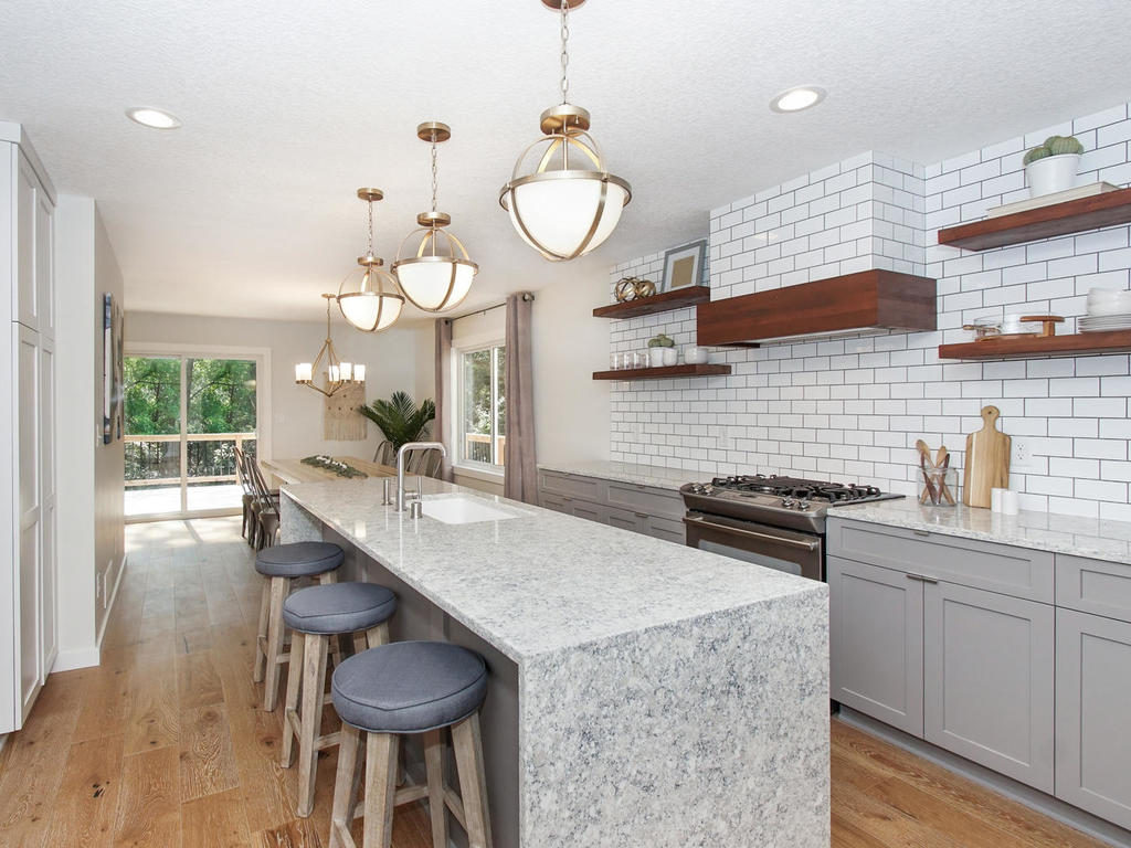
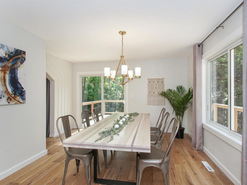

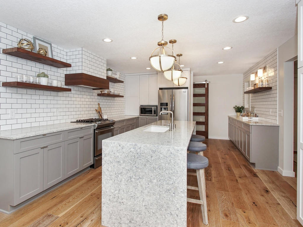

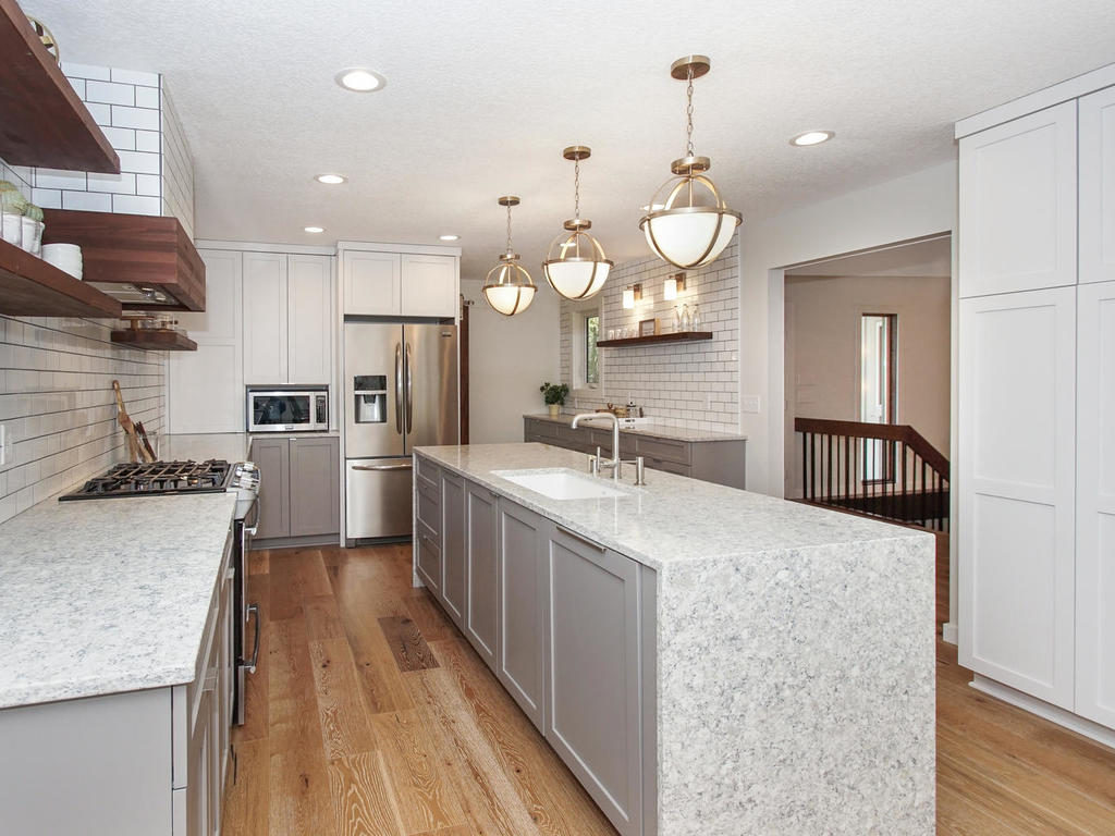


Cheers to a kitchen that is now ready for friends and family! 
SaveSave
SaveSave
SaveSave
North Oaks Reno: Kitchen Edition!
September 19, 2017
Leave a Reply Cancel reply
@ 2022 ADORNED HOMES
INFO@ADORNEDHOMES.COM
DESIGNED BY HONOR
@2022 ADORNED HOMES™ | INFO@ADORNEDHOMES.COM | Showroom By Appointment
0
Be the first to comment